madeline haenle
Creative Director, Brand Designer, and Visual Storyteller


about me
I believe great brands are built with equal parts curiosity, strategy, and craft.
For the past several years, I’ve partnered with startups, global organizations, and established creative studios to bring ambitious ideas to life. My work spans visual identity, digital experiences, editorial design, packaging, environmental graphics, and creative strategy, connecting big-picture thinking with considered execution.
My experience spans industries including wellness, beauty, healthcare, lifestyle, fashion, finance, nonprofit, entertainment, and consumer products, giving me the versatility to translate ideas across different audiences, markets, and touchpoints.
My approach starts with understanding the bigger picture: what a brand stands for, who it needs to reach, and how it should show up in the world. From there, I translate strategy into thoughtful design that feels clear, cohesive, and distinctly its own.
The best design isn't what people notice first. It's what they remember longest.
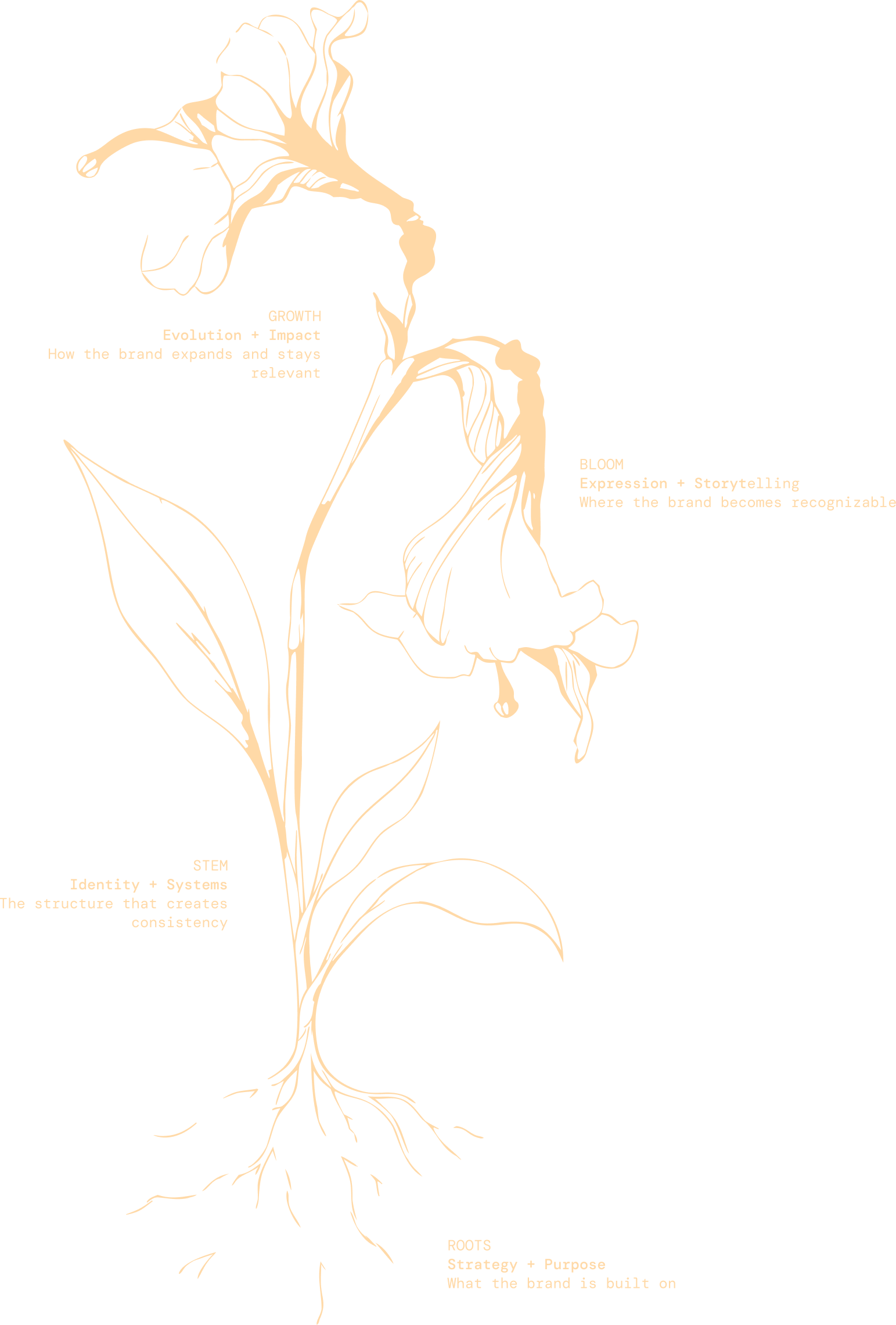
My personal brand is built around the idea of transformation through intentional design.
Flowers serve as a visual metaphor for that process. Each begins with its own identity and potential, yet evolves through its environment, structure, and care into something entirely distinct. I see brands in much the same way: each begins with its own identity and potential, shaped over time into something clearer, more expressive, and entirely its own.
The floral imagery also reflects the balance at the center of my creative practice. Organic but intentional. Expressive but strategic. Unexpected but refined. Paired with structured typography, bold color, and editorial composition, it creates a visual language that feels alive rather than static.
Rather than representing beauty alone, the flowers represent evolution. Brands are living systems. They adapt, expand, and take on new meaning as they move through culture and connect with people. My role is to give that growth direction, transforming ideas into visual worlds that feel distinctive today while leaving room for what they can become tomorrow.

my journey
-
I earned my Bachelor of Fine Arts in Graphic Design from the University at Buffalo, where I developed a strong foundation in typography, systems thinking, and visual storytelling. Alongside my studies, I completed internships across editorial design, marketing, and Division I athletics, gaining early exposure to how design adapts across industries, audiences, and mediums.
Those years taught me that successful design is never about aesthetics alone. It's about solving problems with clarity, intention, and purpose.
-
Seeing Design Through a Business Lens
Joining Vie Healing as Director of Branding & Marketing transformed the way I approached design. For the first time, I was responsible for shaping an entire brand ecosystem, from visual identity and packaging to product development, marketing, and customer experience.
Working directly with leadership strengthened my understanding of how creative decisions influence business strategy, customer perception, and long-term brand growth.
-
As Lead Editorial Designer at Robbins Research International, I had the opportunity to contribute to one of the world's most recognized personal development brands.
Designing educational experiences, editorial systems, and global marketing campaigns taught me how to create consistency across large-scale initiatives while communicating complex ideas with clarity. It reinforced the importance of collaboration, systems thinking, and designing for audiences that span cultures, platforms, and millions of interactions.
-
While continuing my professional career, I grew Brandz Studio, an independent creative practice dedicated to helping businesses translate ideas into thoughtful brand experiences.
Through my studio, I've partnered with startups, nonprofits, wellness companies, creative agencies, and established organizations, leading projects spanning brand identity, UI/UX, packaging, editorial design, environmental graphics, websites, and creative strategy.
This experience strengthened my ability to guide projects from discovery through execution while adapting to a wide range of industries, challenges, and creative teams.
-
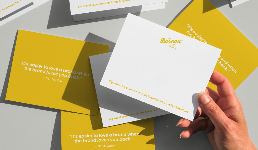
Most recently, I've had the opportunity to collaborate with organizations including Tony Robbins, Bureau of Small Projects, ASOS, Anthropologie, Goop, Kindbody, GirlTREK, MusiCares, American Wildlife Refuges, and many others.
Each collaboration has reinforced something I value deeply: every organization has a unique story to tell, and the role of design is to uncover that story and express it with clarity, intention, and authenticity.
As my work has evolved, so has my perspective. Today, I approach every project as both a designer and a strategic partner, balancing creative exploration with thoughtful decision-making to build brands and experiences that create meaningful connections.
-
Every chapter of my career has prepared me for work of greater complexity, greater collaboration, and greater impact.
As I continue to grow, I'm excited to contribute to organizations where design is viewed as a strategic advantage rather than a finishing touch. I hope to lead multidisciplinary teams, mentor other creatives, and help build products, brands, and experiences that influence culture, inspire people, and solve meaningful problems at scale.
The best work isn't created alone. It's built alongside curious people who challenge one another, ask better questions, and believe that thoughtful design has the power to shape how people experience the world.
case studies
Designing Harmony: The Calm Between Commerce and Care
-
VH began as a wellness studio rooted in acupuncture and Eastern medicine. As the brand expanded into products and e-commerce, its identity became increasingly fragmented. Spa clients weren’t always aware that VH offered products online, while digital customers had little connection to the physical wellness experience behind the brand.
The challenge was to bring these two sides of VH together, creating one cohesive identity that could communicate its philosophy of holistic healing while feeling modern, elevated, and accessible across every touchpoint.
-
I developed a unified brand experience designed to bridge VH’s physical wellness practice with its growing digital and retail presence.
I redesigned the website around an intuitive dual-path experience, allowing visitors to naturally explore either in-person treatments or curated products while maintaining a consistent visual language and brand story throughout.
Beyond digital, I extended the refreshed identity across packaging, physical experiences, partnerships, and branded materials to ensure every interaction with VH felt like part of the same world.
-
Brand Identity Refresh
I refined the logo, color system, typography, and visual language to balance VH’s Eastern medicine roots with a more contemporary wellness aesthetic.Website Design & Development
I redesigned the digital experience with clear pathways for both spa services and e-commerce, connecting the two sides of the business through cohesive storytelling and design.Packaging Design & Production
I designed and developed packaging across multiple product lines, including sourcing and production considerations to bring the brand into the physical product experience.PR & Retail Partnerships
I supported VH’s expansion into national press and retail, helping translate the brand into materials and experiences suited for a broader audience.Events & Collaborations
I created branded experiences and activations across Los Angeles and New York, along with collaborative and partner-branded product lines. -
My work helped transform VH from a fragmented spa and product offering into a cohesive wellness brand, connecting its physical treatments, products, digital presence, and customer experience under one visual identity.
The refreshed brand elevated VH beyond its boutique spa roots and supported its evolution into a nationally recognized holistic lifestyle brand, bringing modern design and traditional wellness practices together through a consistent experience across digital, retail, packaging, and physical spaces.
Color, Culture, and Cannabis: A Modern Event Identity
-
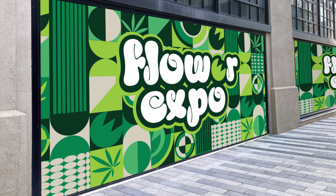
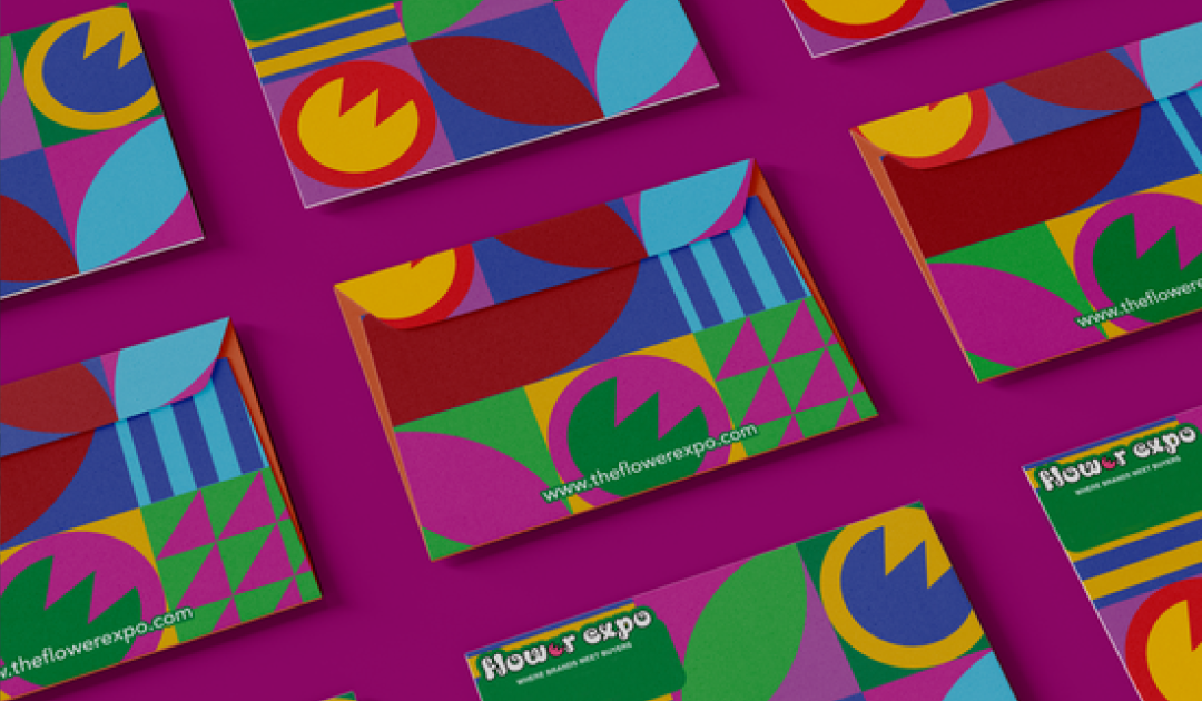
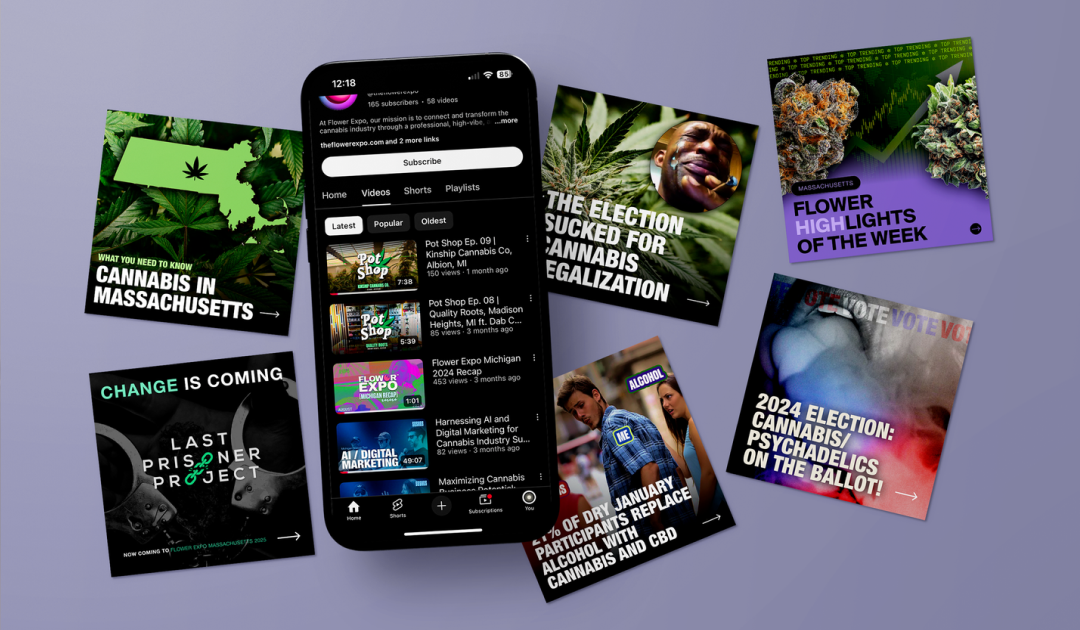
A multi-city cannabis expo was expanding across the U.S. but lacked a cohesive visual identity that could grow alongside it. Existing materials felt generic and inconsistent, failing to capture the vibrant, forward-thinking culture of the industry or create a memorable experience for attendees.
The challenge was to develop a flexible visual system that could evolve from city to city while maintaining a recognizable identity — something bold enough to command attention, structured enough to remain cohesive, and elevated enough to move beyond the visual clichés often associated with cannabis.
-
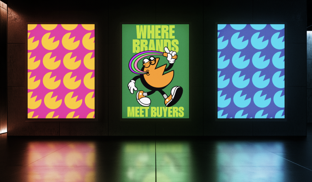
I developed a modular design system that brought together bold creativity and visual consistency across every event location.
At the center of the system was a color-driven approach, with each city receiving its own distinct palette while maintaining the same overarching visual language. This gave each event an individual personality while keeping the broader brand experience cohesive.
I paired this with custom pattern work inspired by cannabis culture and reinterpreted through a contemporary design lens. Abstract forms, energetic gradients, typography, and layered graphics created a visual world that felt playful, expressive, and sophisticated without relying on predictable industry imagery.
-
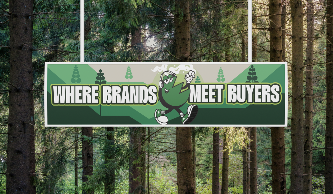
Large-Scale Event Displays & Wayfinding
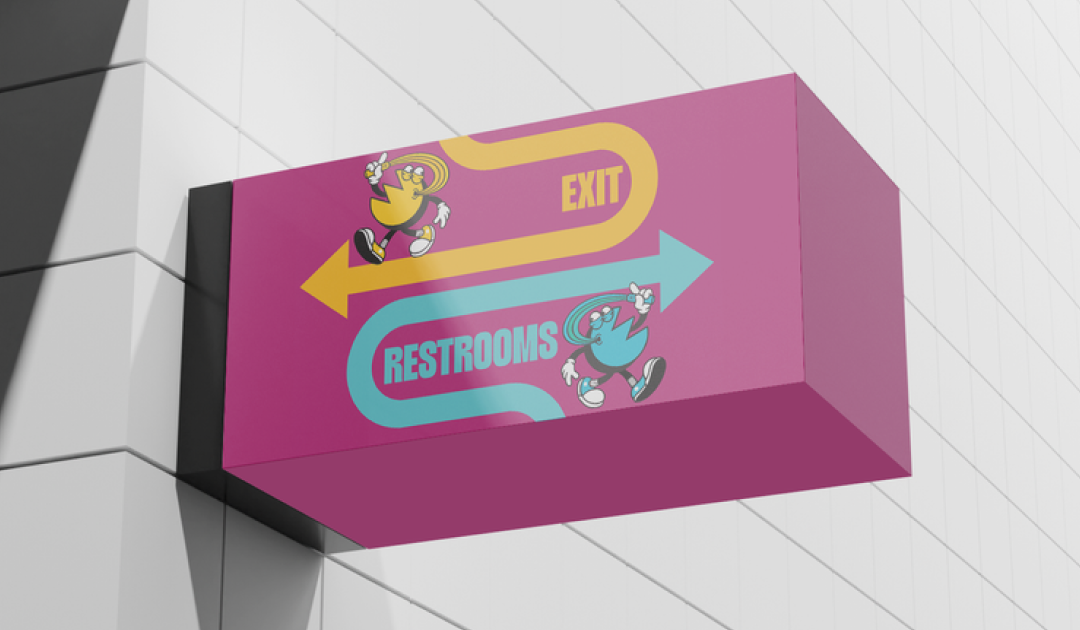
I designed immersive environmental graphics, displays, and directional signage that brought the identity into the physical event space while supporting attendee flow.Stationery & Event Collateral
I created a cohesive suite of printed materials for attendees, staff, exhibitors, sponsors, and partners.Direct Mail Campaigns & Invitations
I extended the event experience beyond the venue through tactile invitations and promotional pieces designed to build excitement leading up to each expo.Social Media Design
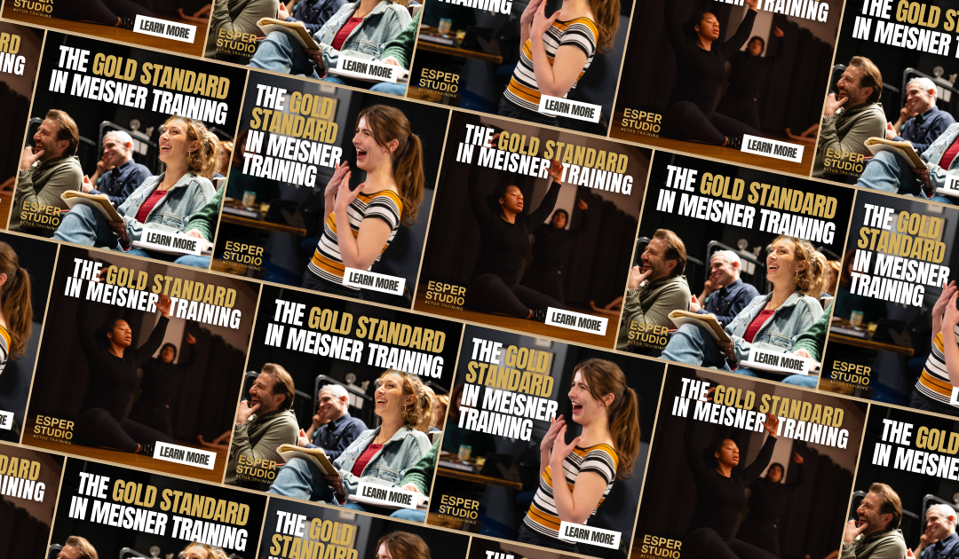
I developed scalable social templates, campaign graphics, and branded assets that could adapt across cities, content, and event cycles.Email Marketing & Digital Advertising
I translated the visual identity into high-impact digital campaigns, creating email and advertising assets that maintained brand consistency while supporting awareness and conversion. -
My work helped transform the expo from a traditional industry event into a more distinct and curated brand experience.
The new system created a recognizable presence that could scale across multiple markets while allowing each city to maintain its own personality. Across digital, print, and physical environments, the cohesive visual language strengthened recognition, elevated the attendee experience, and helped redefine what cannabis industry design could look like.
-
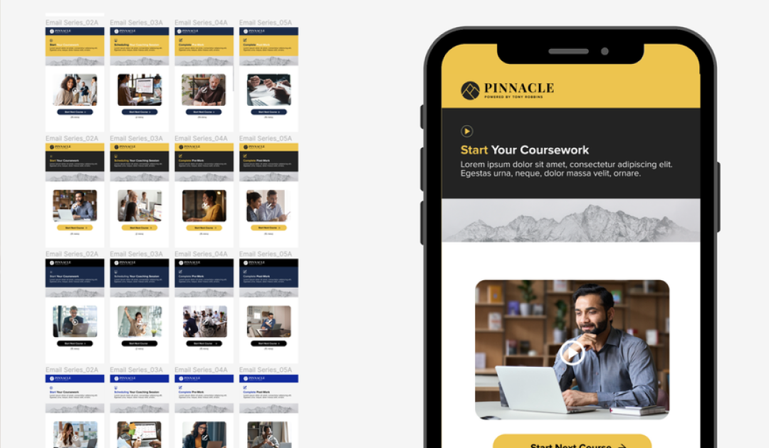
Tony Robbins’ global programs reach millions of people, but the printed and digital materials supporting these experiences had begun to feel disconnected from the energy and evolution of the brand. The manuals relied on dated visuals, typography, and content structures that positioned them more as functional workbooks than meaningful extensions of the event experience.
The challenge was to reimagine the learning materials as something participants would genuinely want to engage with, revisit, and keep — capturing the momentum, clarity, and transformation at the core of the Tony Robbins experience.
-
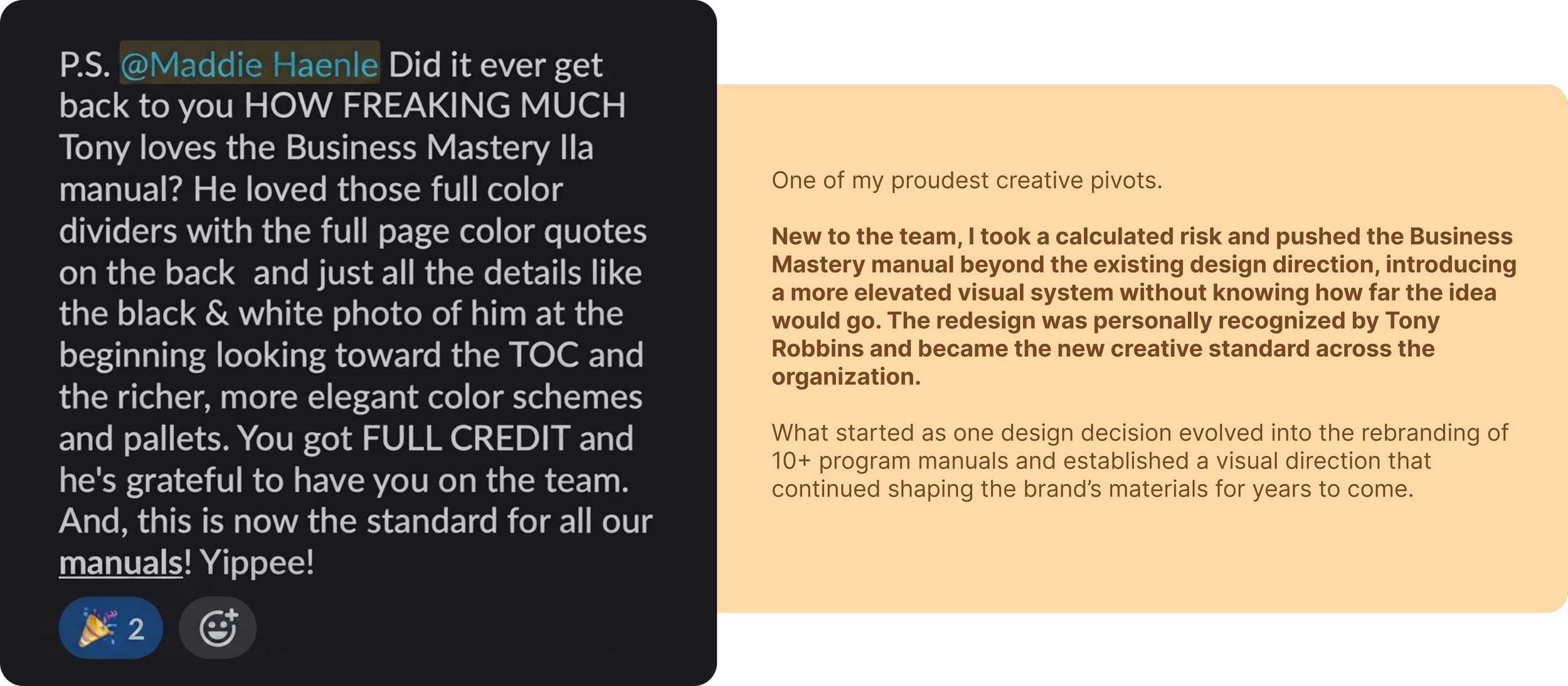
I developed a unified creative system for manuals and program materials that brought a more contemporary visual language and intentional structure to every stage of the participant journey.
I introduced refined typography, stronger graphic hierarchy, updated color systems, and more dynamic layouts to make dense educational content feel approachable and engaging. Each manual was designed as a guided, step-by-step experience, balancing functional learning with moments of visual impact and inspiration.
I also incorporated interactive print elements, including detachable quote pages and poster-style inserts, allowing participants to take meaningful pieces of the experience beyond the event itself.
-
Comprehensive Manual Redesign
I redesigned learning materials across a full year of programming, creating consistency across individual events while allowing each experience to maintain its own identity.Visual System & Art Direction
I established updated typography, color, graphic treatments, and layout systems that brought a more contemporary and elevated feel to the materials.Interactive Print Components
I designed removable quote pages, poster-style moments, and other interactive elements intended to extend engagement beyond the workbook itself.Content & Copy Direction
I helped reshape the presentation and tone of content to create a more direct, motivational, and participant-focused experience.Production Coordination
I carried the system through production to help maintain consistency and design integrity across materials created for global events. -
My work helped transform the program materials from traditional event workbooks into a more immersive extension of the Tony Robbins experience.
By combining intentional design, interaction, and content structure, the redesigned manuals encouraged greater participation and personal reflection while giving the materials value beyond the event itself. What once felt primarily instructional became something participants could engage with, revisit, and keep — creating a stronger connection between the physical materials and the transformative experience they were designed to support.
Designing Transformation: Rewriting the Rules of Self-Development Design
Museum of Contemporary Art of Chicago
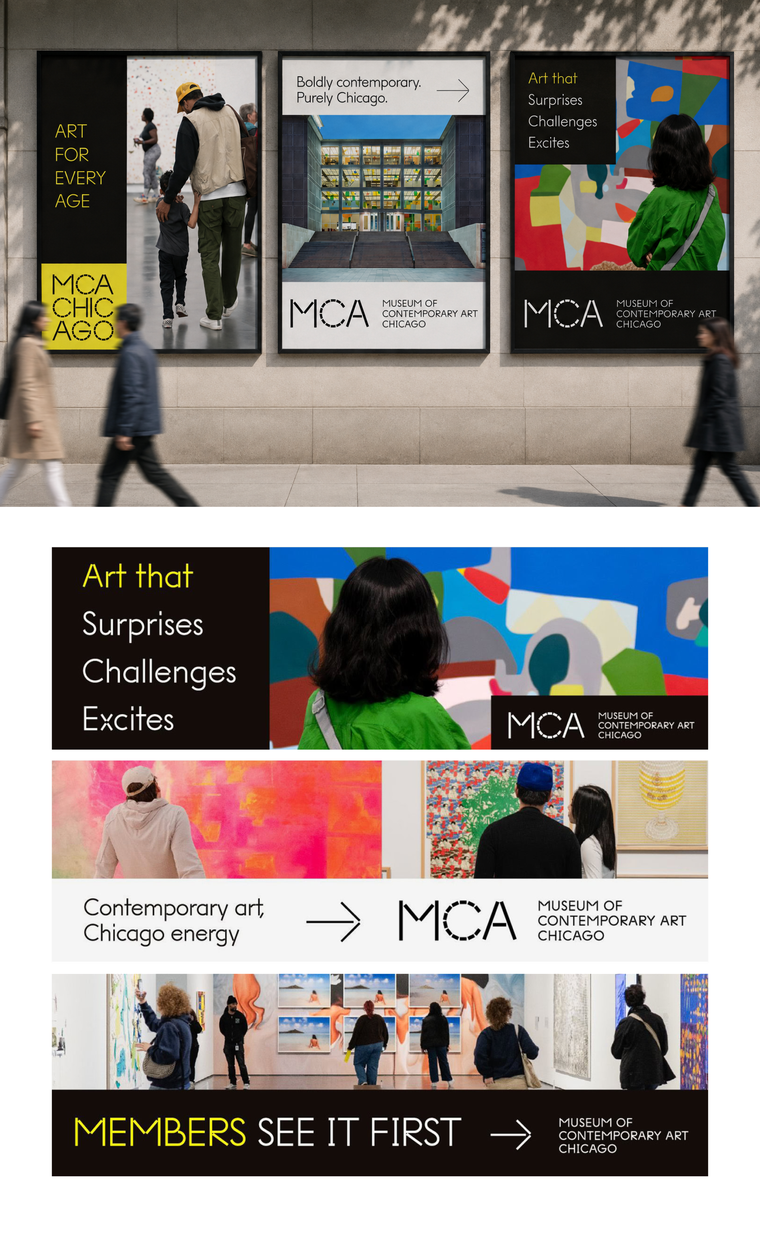
The objective of this campaign was to position the Museum of Contemporary Art Chicago as an accessible, inspiring destination for both residents and visitors. Through a series of bold outdoor advertisements, the campaign sought to shift perceptions of contemporary art by emphasizing curiosity, inclusivity, and everyday cultural engagement.
Using striking photography, clean typography, and confident messaging, the campaign celebrates the museum as a place where creativity is experienced by everyone, regardless of age or familiarity with contemporary art. Each advertisement was designed to capture attention in urban environments while reinforcing the MCA's identity as a vibrant cultural landmark and inviting viewers to step inside and explore.
This project was commissioned through a partner agency. I was responsible for the creative process from concept to completion, including strategy, design, and final production.
Vie Healing
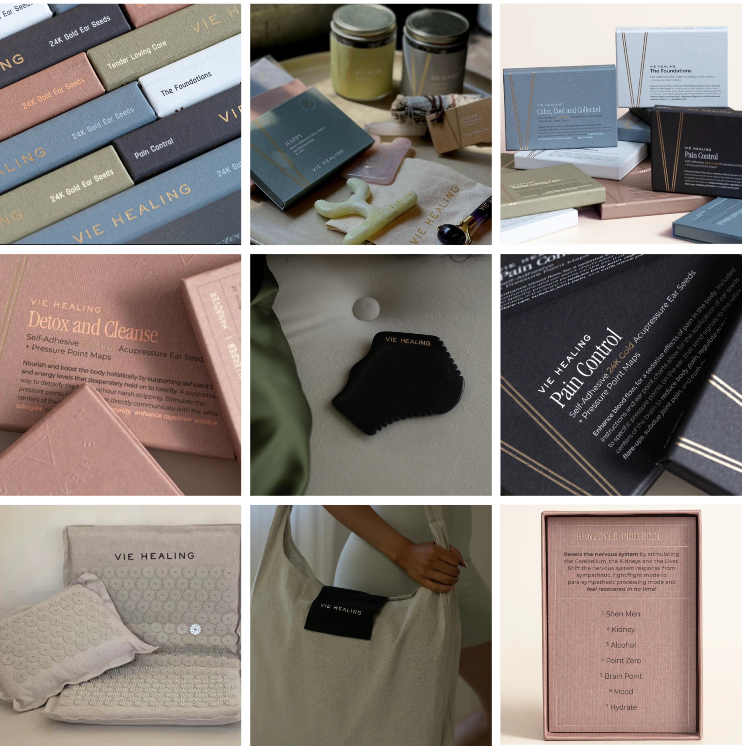
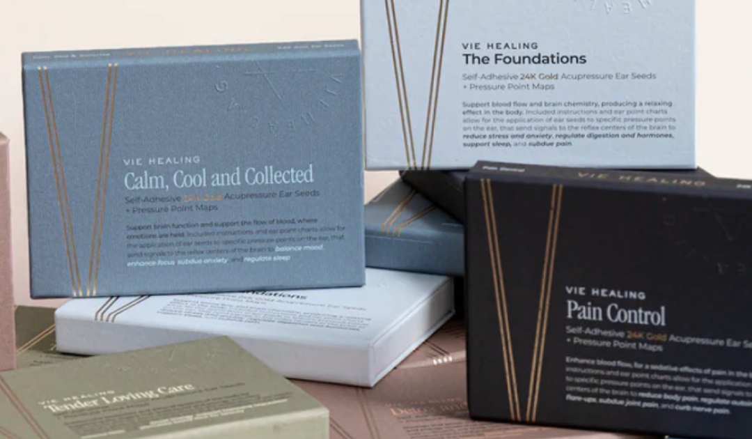
The objective of this work was to translate Vie Healing’s philosophy of holistic wellness into a visual language that felt as calming and intentional as the treatments themselves. Across packaging, printed materials, and physical products, the design needed to communicate softness, care, and ritual while maintaining the elevated quality of a modern luxury wellness brand.
The visual direction draws from the tactile and sensory nature of Vie Healing’s practice. Muted earth tones, dusty pinks, warm neutrals, deep charcoal, delicate typography, and subtle metallic details create a sense of warmth and tranquility. Materials and finishes were intentionally selected to feel natural and refined, while understated layouts allow each product to feel approachable rather than overly clinical. Together, these elements reflect the balance at the heart of the brand: ancient healing practices presented through a contemporary lens.
The work shown includes packaging and collateral across Vie Healing’s growing product collection, including acupressure ear seeds, pressure point maps, acupressure tools, wellness kits, self-care products, and educational materials. Each piece was designed to feel connected while maintaining its own purpose, creating a cohesive system that carries the Vie Healing experience from the treatment room into everyday rituals at home.
Tony Robbins
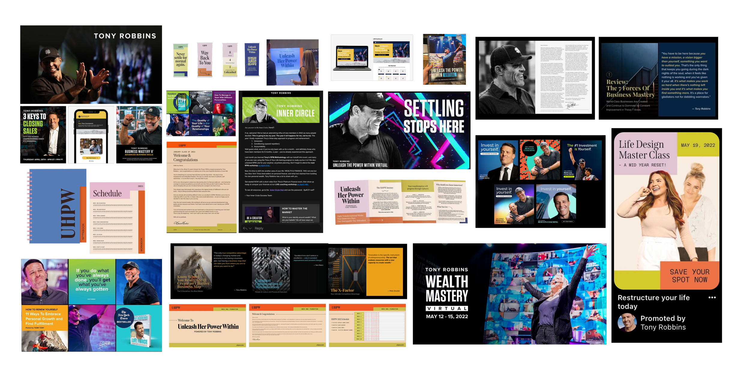
The objective of this work was to evolve the visual experience across Tony Robbins’ programs and digital ecosystem, creating a more contemporary and cohesive system that could carry the energy, motivation, and momentum of the live events into every participant touchpoint. The work spanned the core Tony Robbins brand as well as Unleash Her Power Within, a women-focused extension of the Unleash the Power Within experience.
Across digital campaigns, event materials, learning platforms, and print, I developed visual systems that balanced high-energy motivational content with clear structure and usability. Bold typography, impactful photography, vibrant color, and strong graphic hierarchy reflect the intensity of the Tony Robbins experience, while the Unleash Her Power Within materials introduced a softer, editorial direction through pastel color palettes, expressive typography, and playful layouts designed specifically for its audience.
The work shown includes event and promotional campaigns, digital advertising, social content, program workbooks and schedules, signage, email and landing page design, and LMS experiences. Each piece was designed to function within its individual program while remaining connected to the larger Tony Robbins ecosystem, creating a recognizable experience from the first campaign touchpoint through the event itself and the learning that continues afterward.
Spacemilk
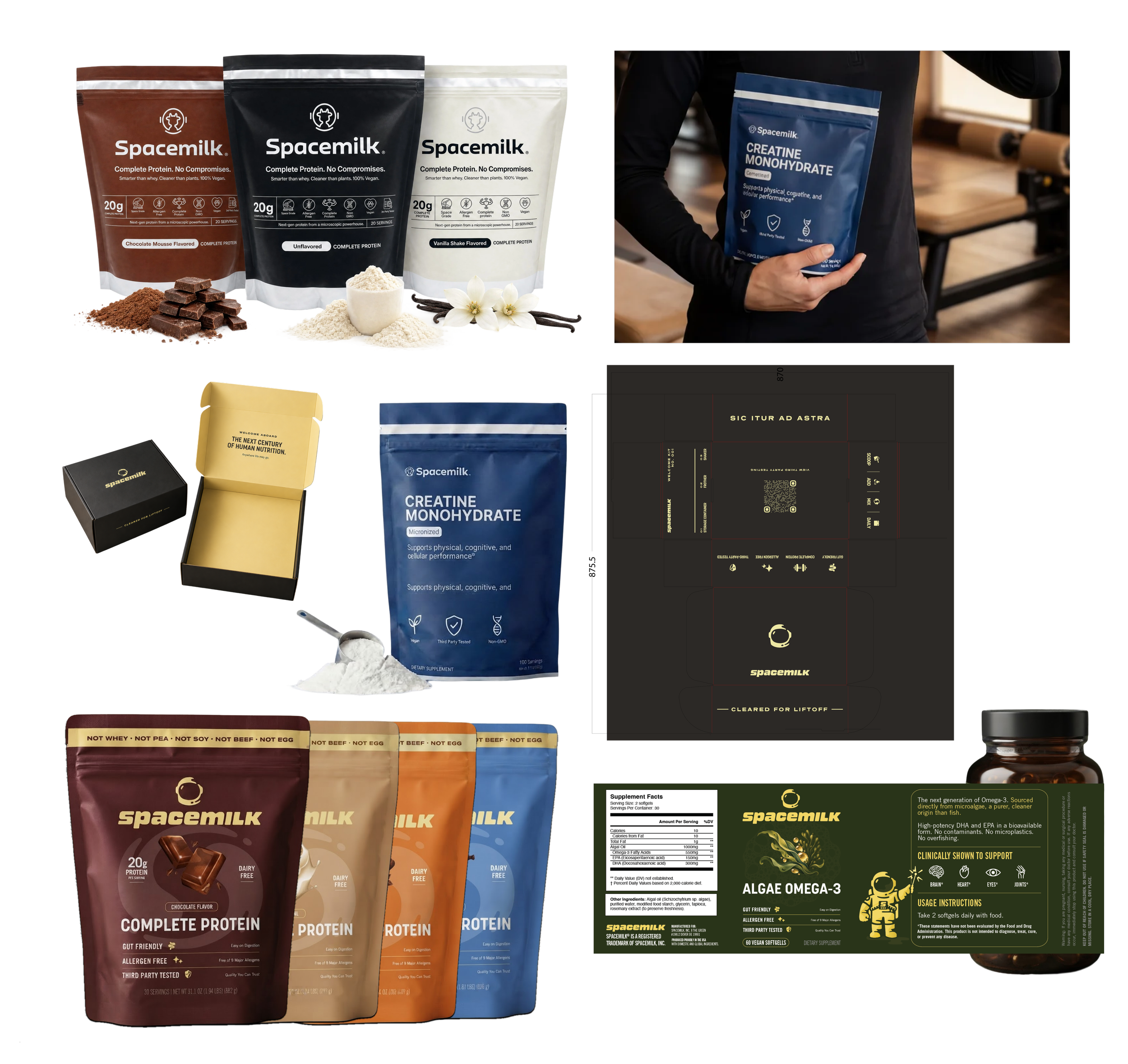
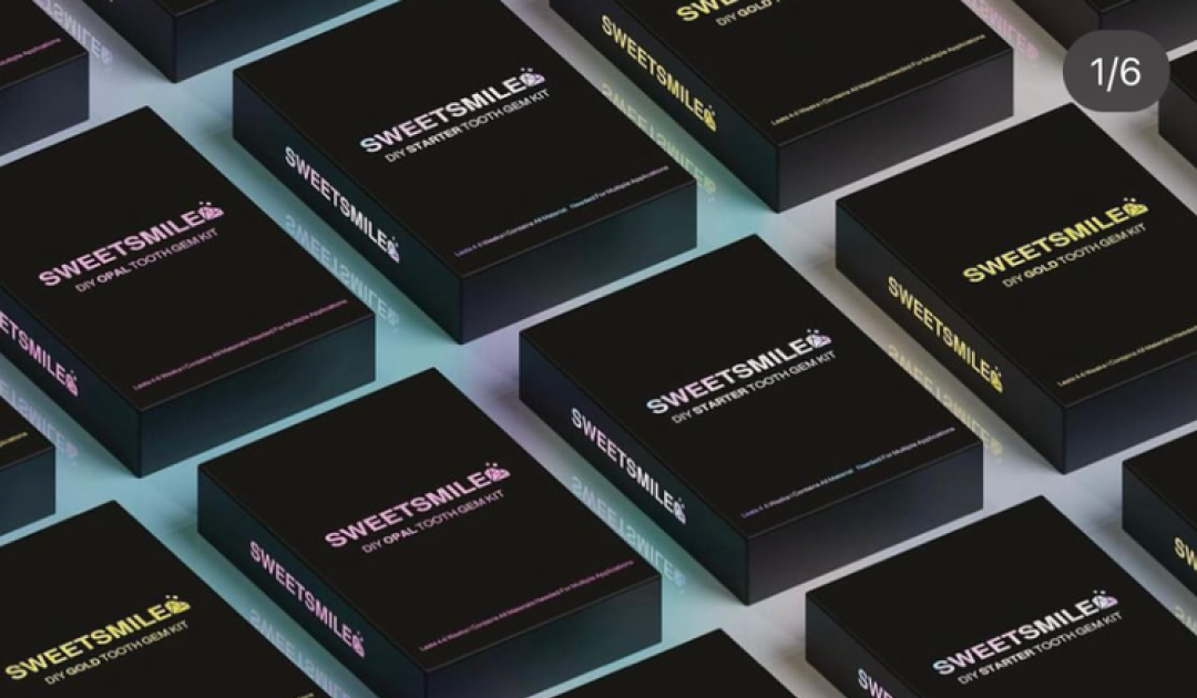
Spacemilk sits at the intersection of performance, nutrition, and everyday wellness, requiring a visual identity that could communicate the science behind its formulas while still feeling modern, approachable, and lifestyle-driven. The challenge was to create a system that made product benefits immediately clear while giving the brand a distinctive presence in an increasingly crowded wellness market.
I developed a packaging system centered around strong typography, minimal layouts, and product-specific colorways, allowing each formula and flavor to stand apart while still feeling part of one cohesive family. Clean structure and high contrast bring a performance-driven quality to the line, while warm flavor-inspired tones and restrained graphic details keep the products feeling premium and accessible rather than overly clinical.
The work shown includes packaging design and development across protein powders, creatine, flavors, and formulations, along with product photography direction, digital campaign creative, and supporting e-commerce assets. Each touchpoint was designed to simplify product information, strengthen recognition, and create consistency across the growing collection — establishing a flexible visual system that can continue to evolve as the brand expands.
Gin Amber Beauty
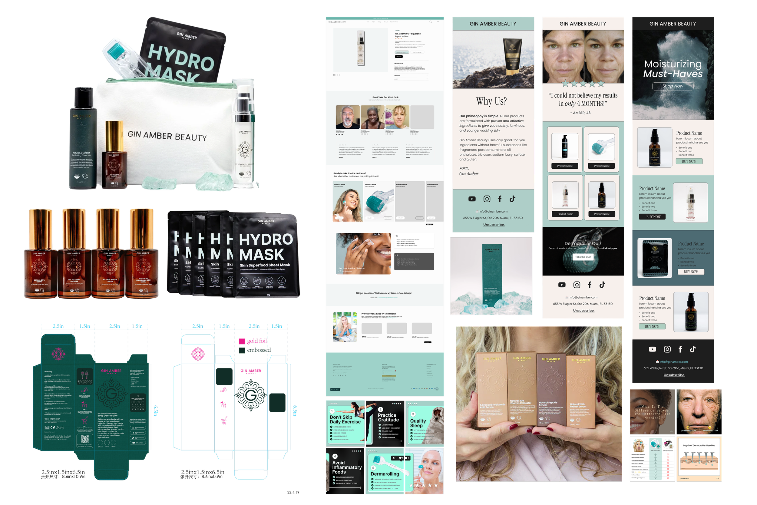
Gin Amber Beauty blends clinical skincare with an elevated, feminine approach to self-care. With a growing collection spanning serums, skincare tools, masks, and treatment-focused products, the brand needed a visual system that could communicate efficacy and expertise while still feeling warm, luxurious, and distinctly personal.
I developed packaging that balances these two sides of the brand through rich amber glass, soft neutrals, muted blush tones, metallic finishes, and refined typography. The color palette was intentionally developed to feel inclusive and universally appealing across all ages and skin tones, moving away from traditional beauty palettes that can feel targeted toward a specific demographic. More clinical products were given clean, information-forward layouts, while subtle pattern work, embossing, and tonal color variation introduced softness and dimension. Together, these elements create a balance between science and beauty, allowing the products to feel credible and results-driven without becoming overly medical.
The work shown includes packaging design and development across skincare serums, treatment products, hydro masks, tools, kits, and supporting product materials. Each piece was designed to work individually while contributing to a cohesive collection, creating a recognizable shelf presence that feels polished, inclusive, and intentional while reflecting Gin Amber Beauty’s approach to modern skincare.
GirlTREK
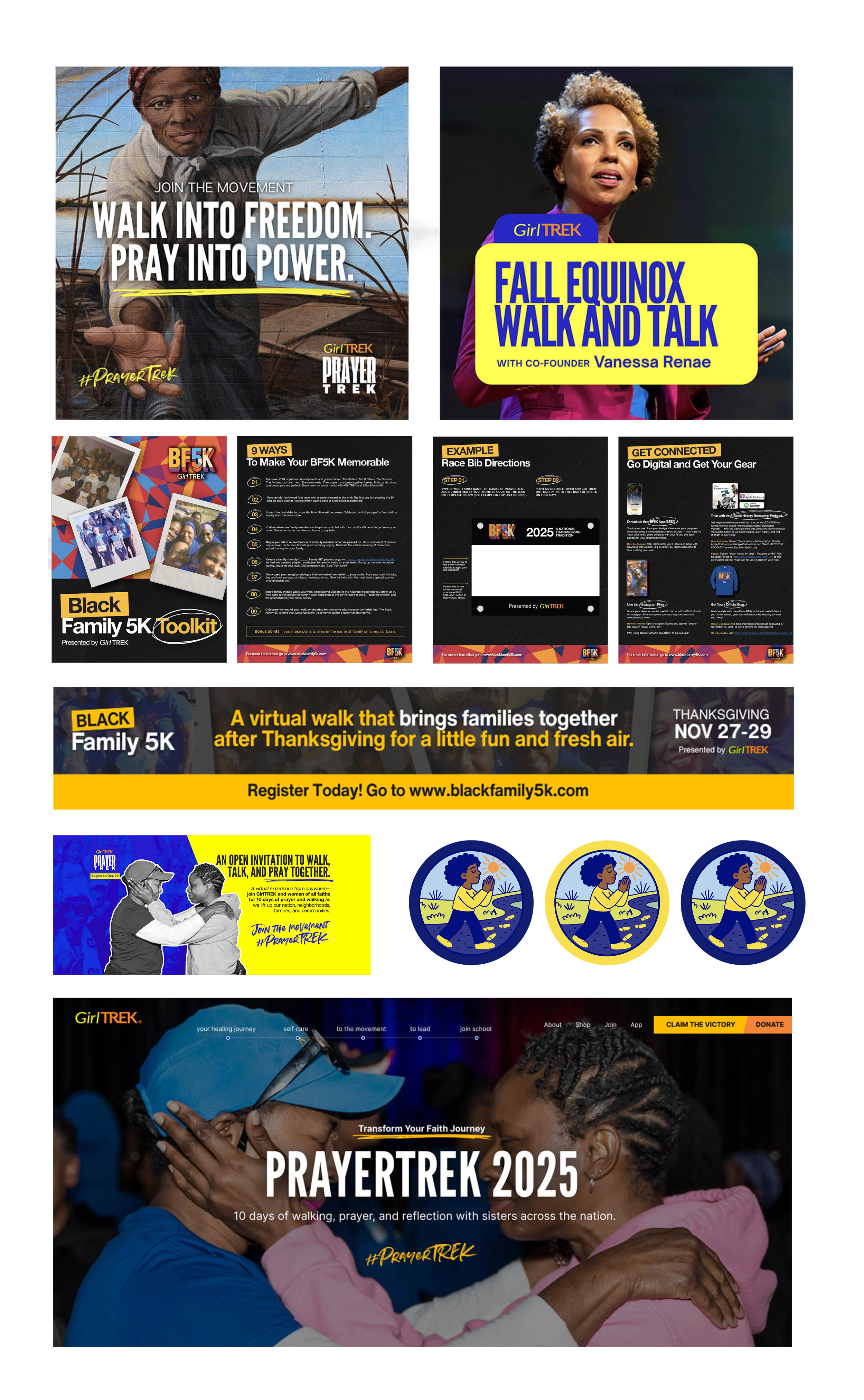
GirlTREK is a movement rooted in the health, healing, and collective power of Black women, using walking as a catalyst for connection, wellness, and meaningful change. The creative needed to carry that same sense of energy and purpose, translating a mission-driven organization into communications that felt bold, culturally resonant, and immediately engaging.
Across campaigns including PrayerTREK, Black Family 5K, and seasonal community initiatives, I developed digital and campaign materials designed to make each activation feel distinct while remaining unmistakably GirlTREK. Vibrant color, expressive typography, powerful photography, illustration, and layered graphic elements create a visual language that feels energetic and contemporary while maintaining the warmth and humanity at the center of the organization. Information-heavy pieces were given clear hierarchy and structure, allowing important resources and calls to action to remain accessible without losing the personality of the campaign.
The work shown includes campaign identities, social and digital graphics, event toolkits, web banners, illustrated assets, informational materials, and supporting brand collateral. Each piece was designed to work across different audiences and touchpoints, balancing moments of celebration and movement with more reflective themes of faith, family, wellness, and community. Together, the system creates a cohesive but flexible presence that reflects GirlTREK as more than a fitness organization: a powerful community built around sisterhood, storytelling, and forward movement.
This project was commissioned through a partner agency. I was responsible for the creative process from concept to completion, including strategy, design, and final production.
CROWBAR Film
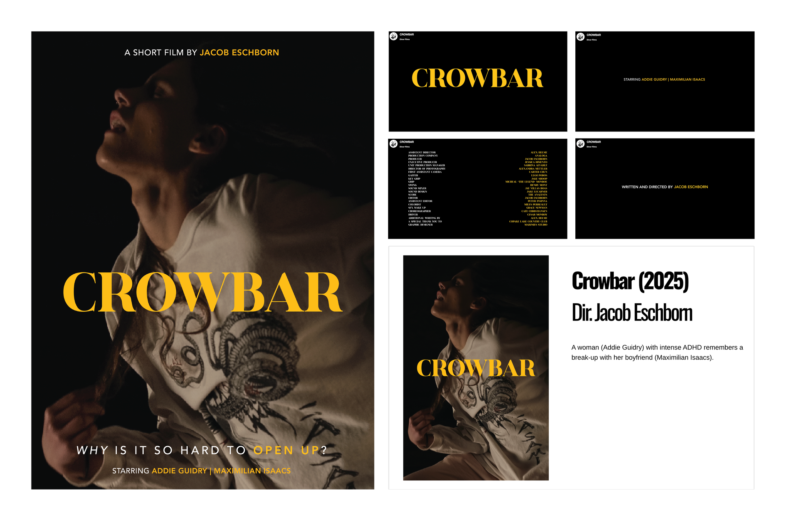
CROWBAR is a short film following a woman with intense ADHD as she remembers the breakup of her relationship, exploring memory, communication, and the emotional difficulty of opening up.
For the project, I created on-screen graphic design and visual assets that appear throughout the film, along with the official movie poster. The work needed to feel authentic to the world of the story while supporting the film’s distinctive visual tone.
The creative direction pairs bold yellow typography, deep black backgrounds, cinematic imagery, and minimal graphic compositions to create a visual language that feels intimate, striking, and slightly tense. The restrained approach allows the emotional weight of the imagery to lead while giving CROWBAR a recognizable visual presence.
The work shown includes the official film poster, on-screen graphics, title and credit treatments, and supporting visual assets created for use within the film.
“It is rare to find someone as diligent, creative, and skilled as Maddie. We've worked closely together for years and are constantly impressed with her ability to execute what is needed thoughtfully and efficiently. She is the best!”
Michael Astorino, CMO at Spacemilk
Direct Client
"Maddie has been a pleasure to work with for a variety of company needs. Whether we're starting a brand from scratch or doing a redesign for a company that we've had for 10+ years, we always reach out to Maddie to create the foundational marketing elements. She's also helped us with website creation. She's very easy to get a hold of, is warm and engaging, and we love working with a real person we can count on."
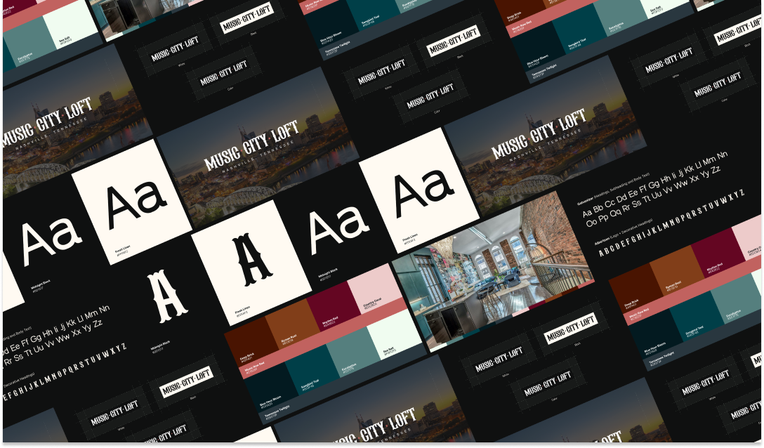
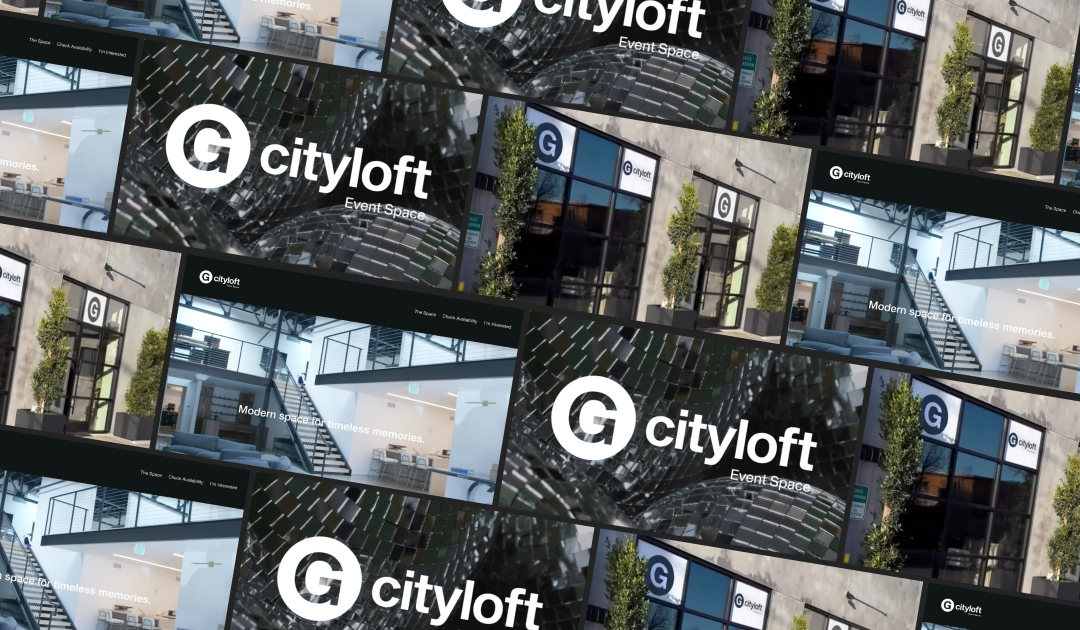
Dani Dubetz, Founder at G City Loft Events and Music City Loft AirBNB
Direct Client
“I've worked with Madeline for a few years now on design, creative, and packaging. She's who I go to when something has to be right.
The quality is consistently high. She's fast and reliable in a way that's honestly rare. If she gives me a date, that's the date. I can't remember a time where we missed a deadline.
The emergencies are where she's really proven herself. Every business has weeks where something breaks and a deadline moves up with no warning. When that happens she's there, and she still hits the timeline. That's not something you can ask of most people, and she's never once made me feel like I was asking too much.
Packaging is the hardest test of all that. It has to look good, feel like the brand, and be technically correct, and once it prints you don't get to fix it. She gets it right.
If you get a chance to work with Madeline, jump on it! Highly recommend her.
Marshall Egger, Founder at Spacemilk
Direct Client
“Madeline was an absolute joy to work with in her role as brand strategist. I was a practitioner in the wellness studio in which she worked. She exudes professionalism, became a seamless and interactive face of the brand with patients and professional contacts alike, and was beyond proactive when it came to recognizing problems and suggesting growth opportunities. She had an uncanny ability to multitask and delivered quality products and experiences in her branding and design tasks! I would highly recommend her for both freelance and team-based opportunities.”
Dr. Kenny Mittelstadt, DACM, DC, L.Ac., FMCP
Former Colleague at Vie Healing
“Working with Maddie for the graphic design on my short film Crowbar was effortless because she was able to take a minimal amount of direction and turn it into my exact vision!”
Jacob Eschborn, Film Director
Direct Client
“Working with Maddie has been an absolute joy. Not only is she super creative with “outside the box” ideas, she’s also such a hard worker. Her ability to take on anything thrown at her and remain calm and collected is awe inspiring. I always knew I could count on her. She will be an asset to anyone she works with.”
Sara Grant, Senior Designer
Former Colleague at Tony Robbins
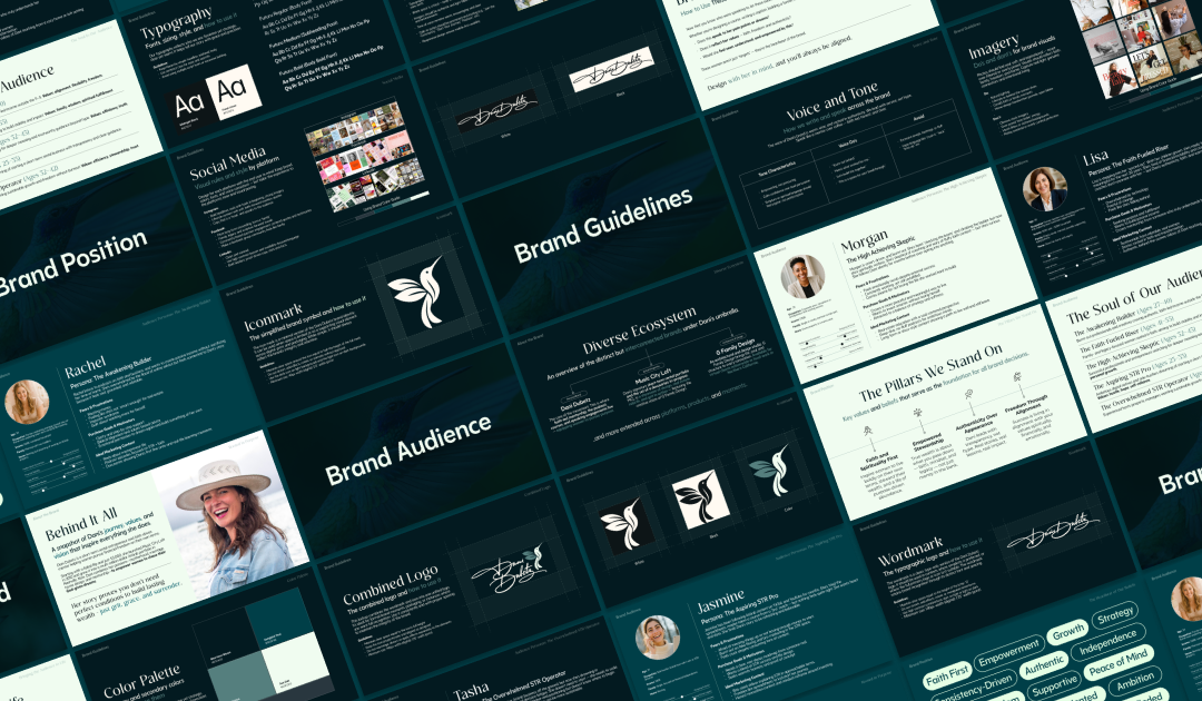
“Madeline is wonderful to work with – she is an excellent listener, creative, and attentive to detail. She understood the concept quickly and came up with a beautiful logo that embodied my vision. Highly recommend.”
Beth Geolat, Founder at Centered Soul Collective
Direct Client
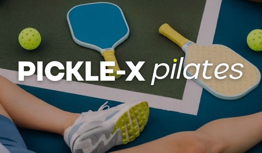
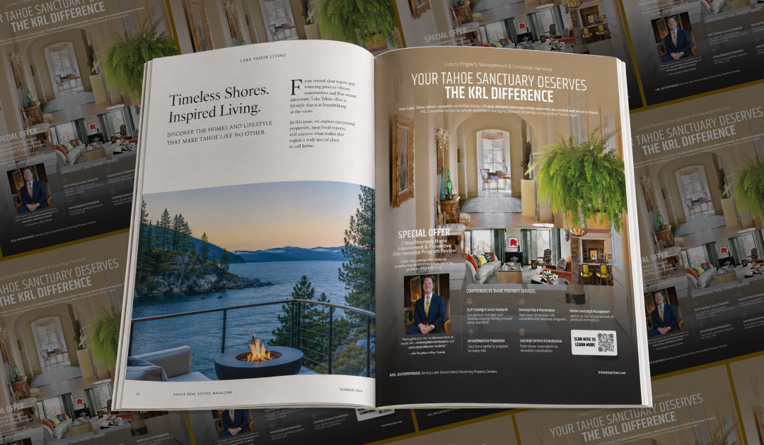
Madeline came highly recommended to me by an industry colleague, and she exceeded my expectations from day one. She has been a true professional—responsive, creative, and fantastic to work with! She took my vision for both digital and paper marketing assets, as well as branded merchandise for my open house and brought them to life. Her ideas are current, her communication is top-tier, and her delivery has consistently been on target. I highly recommend her and will absolutely continue using her services.
Siri Anseth, Founder at BlueBird Pilates Studio and Pickle-X Pilates
Direct Client